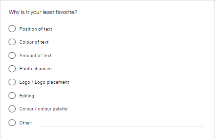
Advertisement review and survey
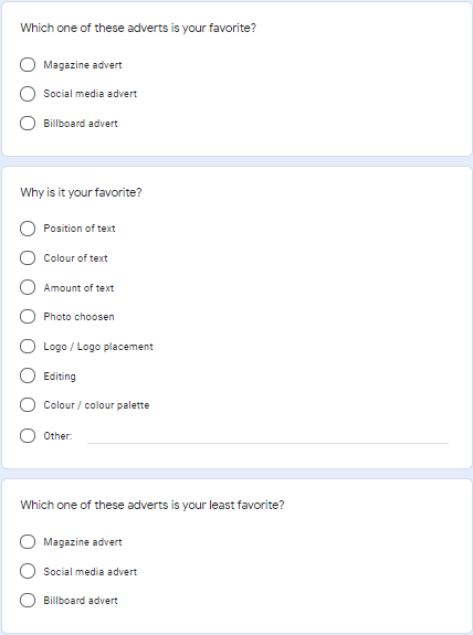
After finishing our advertisement, I created a survey to review and improve my advertisement. I created the questionnaire in Google form and collected the result from 11 different classmates and teachers. Here is the questionnaire I send out.
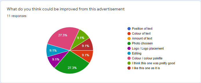
Survey result
|
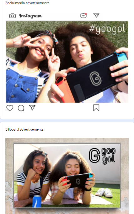
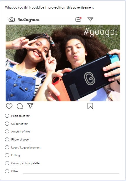
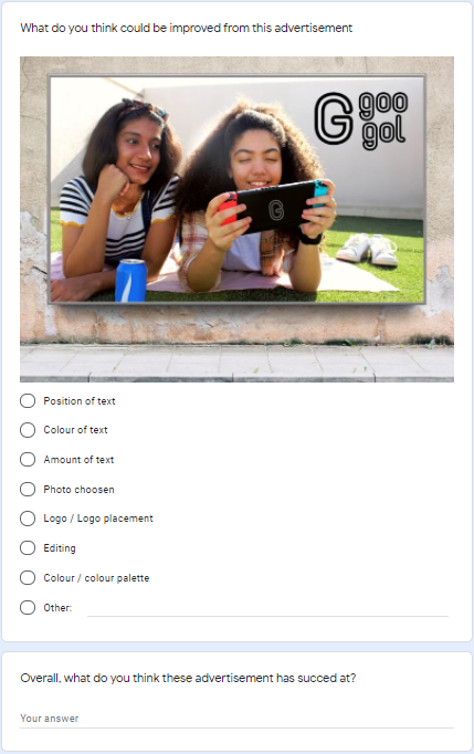
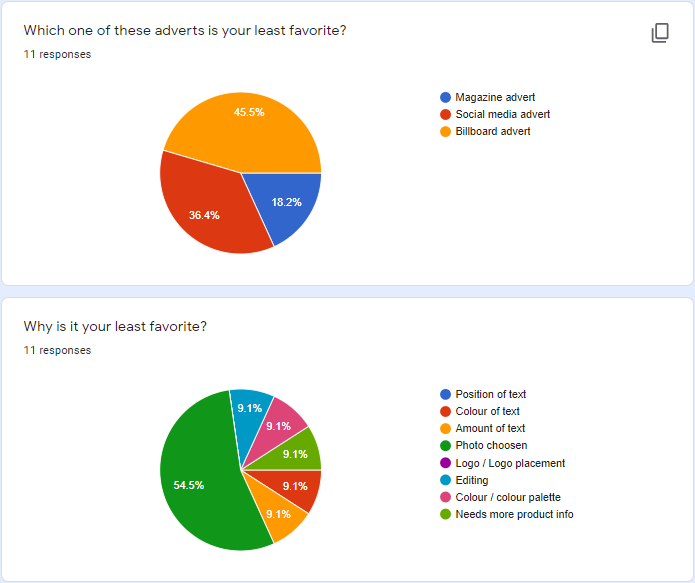
This is the result I got for my social media survey. Immediately I can see that to improve the advertisement I would have to choose a different photo. The second one is the amount of text, in the original advertisement there was not a lot of information surrounding the product, so I decided to add more in the final advertisement. It is also voted as favorite alongside the magazine advertisement so I try to keep it in a similar style.
|
|
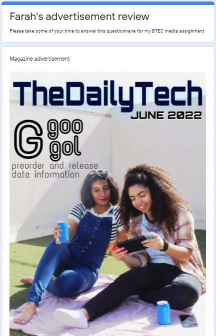
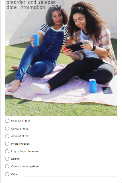
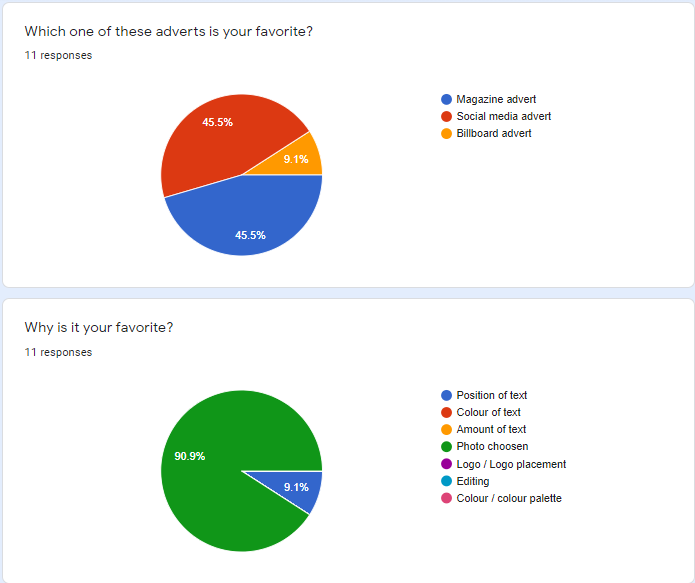
This is the result I got for my magazine survey. Based on the survey, the three main things I have to improve on is the amount of text, color palette, and logo placement. another main thing is that it is not supposed to be a magazine cover but an advertisement inside the magazine. So for this advertisement I also intend to include more information and use a different photo to put the logo in a more suitable position and a more cohesive color. The magazine advertisement is also voted as the favorite with the least amount of people voting it as least favorite. Based on the reason why it is people's favorite, it seems that most people like the photo chosen. However, I am not sure on how I will work the same picture as I try to improve it, so I might have to choose a different picture.
|
|
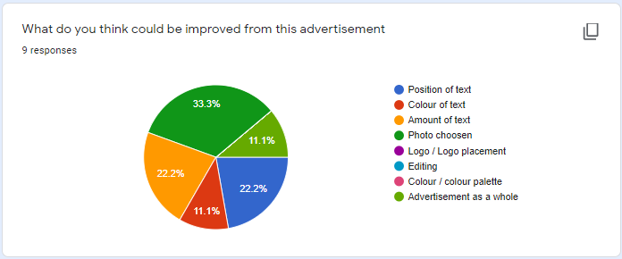
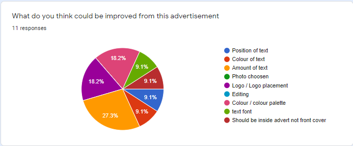
This is the result I got for my billboard survey. The two main parts I need to improve are the photo chosen and color palette. For the final advertisement I would use a different photo that has a brighter and clearer color scheme. This action is also taken based on the least favorite advertisement result as the billboard advertisement is voted the least favorite for the photo chosen as the main reason.
|
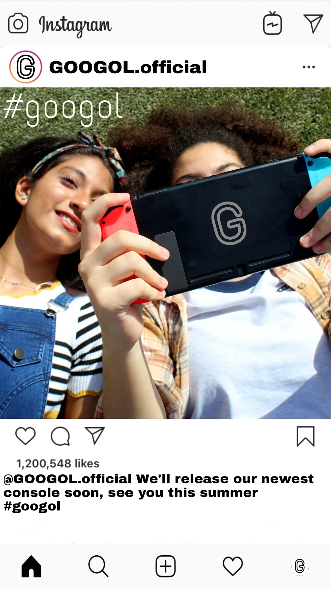
Final advertisement
Magazine
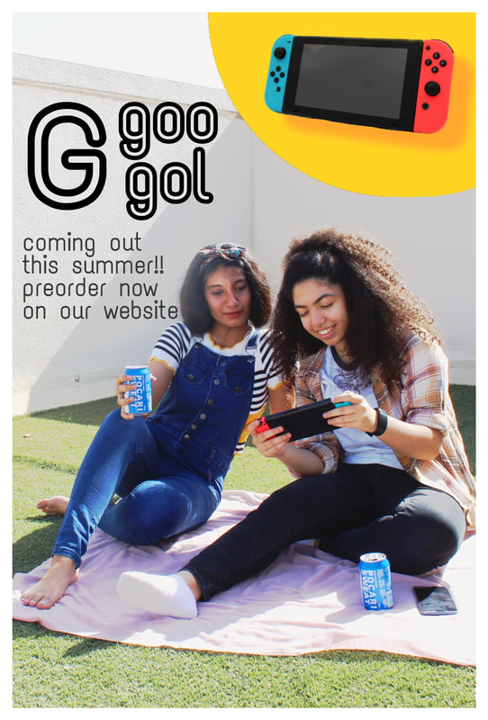
Social media
Billboard