Ass 2 - Advertisement Moodboard & Mindmap
- Video game console
Advertisement mind map & mise en scene
- Logo, brand name
|
Overall brand ideas:
Something fun, a bit serious, appeal to boys but also a bit feminine, maybe sort of an androginous appeal so that it could appeal to both gender and a younger audience. I’m aiming for something fresh and light videogames can be something enjoyed by everyone Appeal: Pathos appeal, Lifestyle appeal, slice-of life appeal I choose this appeal because video games are often used as a method of escapism where people can experience a better world that they usually don’t get to. What I want my brand to be associated with: Fun times, familiarity, adventure, joy, thrill, comfort, home, youth, friendship, boldness, amusement, excitement, exhilaration Colours: red, blue(adventure and masculinity), pink, yellow, and purple (youth, joy, femininity) |
|
Brand name:
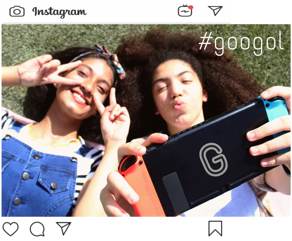
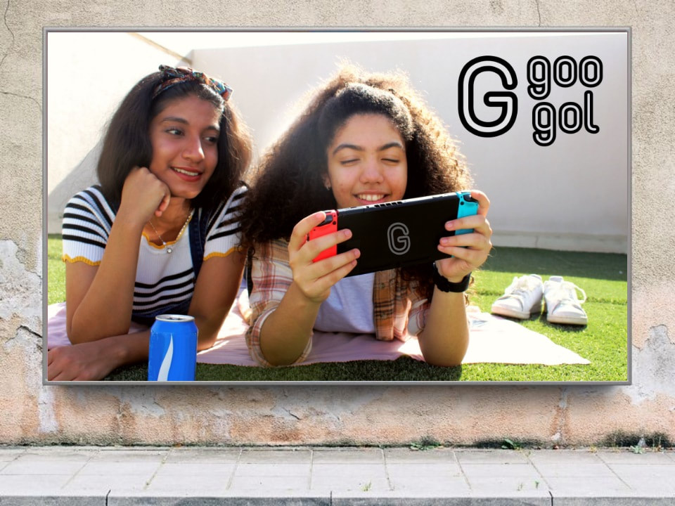
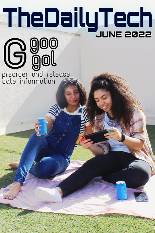
I decide to choose Googol as the brand name. The word googol is a mathematical term to describe 10 to the power of a hundred. It is a famously huge number and for you to write it, you would need to write one followed with 100 zeros. The reason why I think the name would be fitting is because it is describing a number entirely made by one and zeros. This fact alludes to the binary number use to code computers where the entire code is written entirely in ones and zeros. The word googol also has a quite playful connotation to it which I find fitting for a video game console aimed at children and young adults. |
|
Brand logo:
I did my first experiment with designing the logo in a black background to make the colours pop up. I created the draft in my phone using the app Picsart since I find it easier to use, although it doesn’t have some of the features photoshop have. I like the font Orbitron and Text Me One since it is round and it helps to promote the playfulness of the product. The colours are keep simple using a combination of white, red, blue, and black I choose this color scheme since it’ll work with the colors of the object I am using for the photo (Nintendo Switch). I designed it with a white or black outline and blue to red gradient on the inside. I try to keep it simple and futuristic to better fit the product. |
- Target audience
|
I choose this target audience because I find it the most suitable for the product I am advertising since video game consoles have always been traditionally targeted at children and young adults. The reason why I choose both genders as my target audience is because of the increase in popularity in video games. Despite most video game consoles adopting a more masculine image for themselves, a lot of young girls still grow a liking to them and often find a sense of belonging to the community. But to appeal to a wider audience, it is important to consider the different perspective men and women have towards the world of video games and incorporate both of them to successfully grab their attention. I also choose middle class and above as my target audience since video game consoles are regarded as an item of luxury and often costs a lot of money.
|
- Clothing
|
I am thinking about using casual clothing style to keep the advertisement more energetic and youthful since our main consumer target are young adults and children. I would like it to be colourful, cheerful, but still has a sense of maturity to itso it can attract the older demographic
|
- Lighting, equipments, and props
|
Canon DSLR - EOS 400D
I borrowed a Canon DSLR-EOS 400D from the school’s BTEC media department, I find it easier to take pictures with compared to a smartphone. It also works really well in different types of lighting |
|
Nintendo Switch
I use the Nintendo Switch for the video game console I am advertising by changing some parts of the detail so it can fit the brand and make it look as if it”s my own product. I also really like the colour of the console and it fits the theme of the brand |
|
A can of soft drink
I added in a canned soft drinks to make the advertisement look more casual and fun. I try not to let the focus on the photo to shift from the console to the drink |
- Location - rooftop
|
I have finally decided to use the rooftop for my location. While it is possible to shoot in two different locations, There are some obstacles I find when it comes to shooting in the living room. The reason why I finally decided to shoot in the living room is because of its easy access to direct sunlight. We arrived on the spot around 08:30 and the sun was very bright. I was aiming for a warm lighting by using the golden hour, but I am fond of the cheerful tone brought by the whiter lighting. It is also an open space which gives a blue sky background which helps connote freedom and joy that the brand is aiming for. Different sections of the rooftop also creates various background for each photo.
|
- Model
|
Tanvi
|
|
Renad
|
Creating the advertisement
I used the Picsart application on my phone to edit all of the photos
|
|
|
